Angular Material expansion panel | mat-expansion-panel code
You learn about material expansion implementation in an angular application using a Material library.
An expansion panel is an interactive UI component rendered as either collapsed or expanded state.
The expansion panel can be triggered using a mouse click or keyboard interaction.
Angular material expansion panel provides different components.
You can check other angular material examples.
import MatExpansionModule into angular application root module
angular material provides an expansion panel to view the content in the expanded view of a panel.
The material provides a MatExpansionModule module which you need to import into the angular project.
Here app.module.ts is the root module, imported into it and it is available across all components
import { MatExpansionModule } from "@angular/material/expansion";
app.module.ts file
import { MatExpansionModule } from "@angular/material/expansion";

@NgModule({
  imports: [MatExpansionModule],
  declarations: [AppComponent, BasicExpansionPanelComponent],
  bootstrap: [AppComponent],
  providers: [],
  exports: [],
})
export class AppModule {}
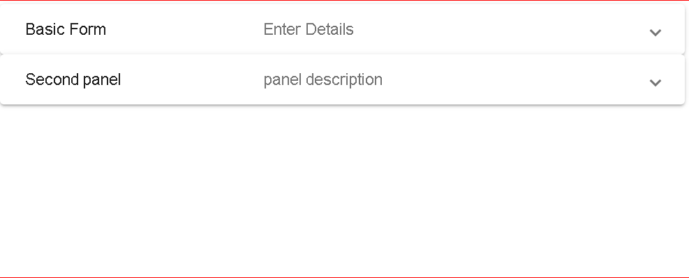
Basic Angular material expansion component example
This example contains expansion panels, one of the panels contains material input form and the other is a just description.
Create a basic component basic-expansion-component.html basic-expansion-component.html:
<mat-expansion-panel>
  <mat-expansion-panel-header>
    <mat-panel-title> Basic Form </mat-panel-title>
    <mat-panel-description> Enter Details </mat-panel-description>
  </mat-expansion-panel-header>

  <mat-form-field>
    <mat-label>Name</mat-label>
    <input matInput />
  </mat-form-field>

  <mat-form-field>
    <mat-label>phone</mat-label>
    <input matInput type="number" min="1" />
  </mat-form-field>
</mat-expansion-panel>
<mat-expansion-panel>
  <mat-expansion-panel-header>
    <mat-panel-title> Second panel </mat-panel-title>
    <mat-panel-description> panel description </mat-panel-description>
  </mat-expansion-panel-header>
  <p>This is second panel</p>
</mat-expansion-panel>
Steps to use the expansion component in the angular component
mat-expansion-panelis a root element defaults collapsed state, on clicking it shows a detailed view- It contains nested child element
mat-expansion-panel-headerwhich is the header element - header panel contains
mat-panel-titleandmat-panel-description - Next element to mat-expansion-panel-header contains expansion panel content
- expansion panels are optionally enclosed in
mat-accordion.

adding a material list to the Expansion panel
expansion panel can also be included in the material navigation list. This expansion panel contains material list items -mat-list-item.
<mat-nav-list>
  <mat-expansion-panel>
    <mat-expansion-panel-header>Menu</mat-expansion-panel-header>

    <a mat-list-item>Menu 1</a>
    <a mat-list-item>Menu 2</a>
  </mat-expansion-panel>
</mat-nav-list>
dynamic angular material expansion panel example
Dynamic expansion components are created with the ngFor loop.
Created an array of books in the Angular component which contains titles and description
  public books: Array<any> = [
    { title: "book1", description: "book desc 1" },
    { title: "book2", description: "book desc 2" },
    { title: "book3", description: "book desc 3" },
    { title: "book4", description: "book desc 4 " }
  ];
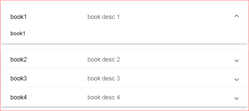
using ngFor Directive iterated and constructed an expansion panel with title and description initialed with array object.
expansion panelist is wrapped inside mat-accordion
<mat-accordion>
  <mat-expansion-panel *ngFor="let book of books;">
    <mat-expansion-panel-header>
      <mat-panel-title>{{book.title}}</mat-panel-title>
      <mat-panel-description>{{book.description}}</mat-panel-description>
    </mat-expansion-panel-header>
    {{book.title}}
  </mat-expansion-panel>
</mat-accordion>
Output:

Display expansion panel
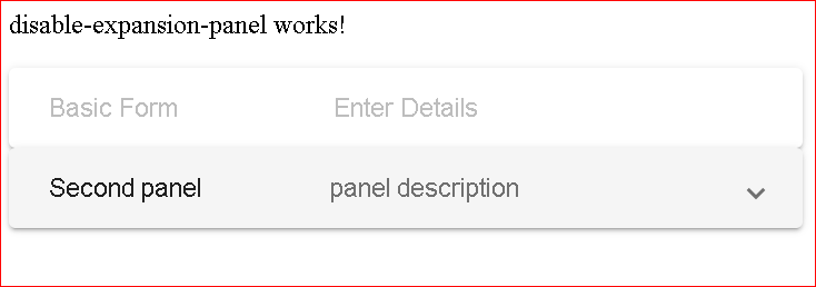
There is a disabled attribute set to true for mat-expansion-panel
This will disables
<mat-expansion-panel [disabled]="true">
  <mat-expansion-panel-header>
    <mat-panel-title> Basic Form </mat-panel-title>
    <mat-panel-description> Enter Details </mat-panel-description>
  </mat-expansion-panel-header>

  <mat-form-field>
    <mat-label>Name</mat-label>
    <input matInput />
  </mat-form-field>

  <mat-form-field>
    <mat-label>phone</mat-label>
    <input matInput type="number" min="1" />
  </mat-form-field>
</mat-expansion-panel>
<mat-expansion-panel>
  <mat-expansion-panel-header>
    <mat-panel-title> Second panel </mat-panel-title>
    <mat-panel-description> panel description </mat-panel-description>
  </mat-expansion-panel-header>
  <p>This is second panel</p>
</mat-expansion-panel>

Open By default expansion panel toggle in angular
Below is an example of expanding/collapsing a programmatic expansion panel.
mat-expansion-panel provides opened and closed events that evaluate to true or false and executes expand or collapsed based on the boolean value.
<mat-expansion-panel (opened)="isOpened = true" (closed)="isOpened = false">
  <mat-expansion-panel-header>
    <mat-panel-title> Basic Form </mat-panel-title>
    <mat-panel-description> Enter Details </mat-panel-description>
  </mat-expansion-panel-header>

  <mat-form-field>
    <mat-label>Name</mat-label>
    <input matInput />
  </mat-form-field>

  <mat-form-field>
    <mat-label>phone</mat-label>
    <input matInput type="number" min="1" />
  </mat-form-field>
</mat-expansion-panel>
<mat-expansion-panel>
  <mat-expansion-panel-header>
    <mat-panel-title> Second panel </mat-panel-title>
    <mat-panel-description> panel description </mat-panel-description>
  </mat-expansion-panel-header>
  <p>This is second panel</p>
</mat-expansion-panel>
In the Angular typescript component Initialize isOpened boolean value to true It does expand the first panel by default
export class ExpandExpansionComponentComponent implements OnInit {
  isOpened = true;

  constructor() {}

  ngOnInit() {}
}
Below example, you can use a button click event to set true or false to expand/collapse toggle functionality in the expansion panel.
Button click toggle expansion panel
This example expands and collapses the expansion panel with a button click.
Here is an angular template component
<mat-expansion-panel [expanded]="isOpen">
  <mat-expansion-panel-header>
    <mat-panel-title> Panel Header Title </mat-panel-title>
  </mat-expansion-panel-header>

  <p>Panel Body</p>
</mat-expansion-panel>

<button mat-raised-button (click)="toggleExpansion">Toggle</button>
In typescript angular component, Added boolean variable isOpen with false, which means the panel is collapsed by default. Created button event handler with changing isOpen value to the inverse of existing value
@Component({
  selector: "my-app",
  templateUrl: "./app.component.html",
  styleUrls: ["./app.component.css"],
})
export class AppComponent {
  isOpen: boolean = false;

  toggleExpansion() {
    this.isOpen = !this.isOpen;
  }

  constructor() {}
}
Conclusion
To Sum up, I Learned a material expansion panel with examples in Angular.
